Customiser Structure
To help bring consistency across the capital builds we have put together a basic section customiser guide, this includes a lot of the commonly used elements as well as the general order they should be used in.
There is nothing worse for a user than going into different sections on a build and things being named differently/working differently or in a different order on the same site.
Always use sentence case when adding labels and info in the Customiser, this way it will be consistent across all sections/developers.
Where an example has "info" then this should be used verbatim unless there is an obvious dynamic part to it i.e. image sizes.
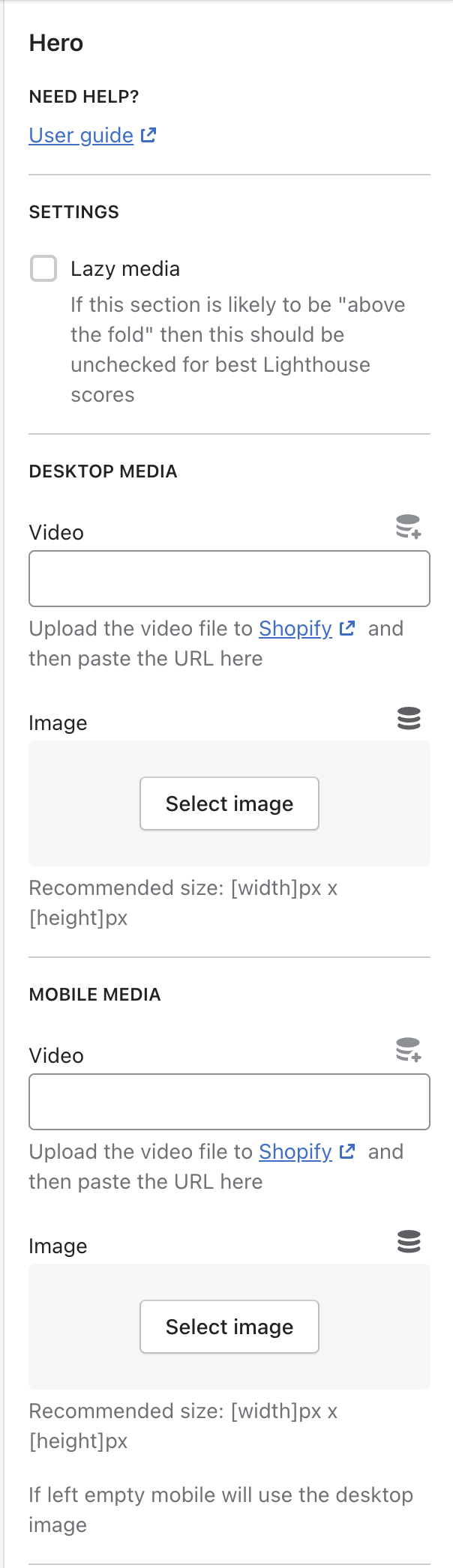
- User Guide
- Settings
- Media
- Content
- Auto/Manually populate
- Style
- Full Example

In cases like the Header dropdown where there is a lot of complexity that can't be explained in the label/info and it requires a separate User Guide, we add this at the top of the section so they can easily jump to that.
{
  "type": "header",
  "content": "Need help?",
  "info": "[User guide](https://link.tothebasecamp.thread)"
}
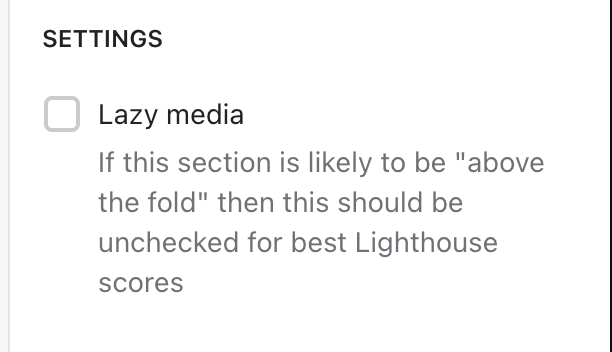
Lazy Media
This is used to control whether to preload css and images or not and this will have a direct effect on a pages performance score
{
  "type": "header",
  "content": "Settings"
},
{
  "type": "checkbox",
  "id": "lazy_media",
  "label": "Lazy media",
  "default": true,
  "info": "If this section is likely to be \"above the fold\" then this should be unchecked for best Lighthouse scores"
}
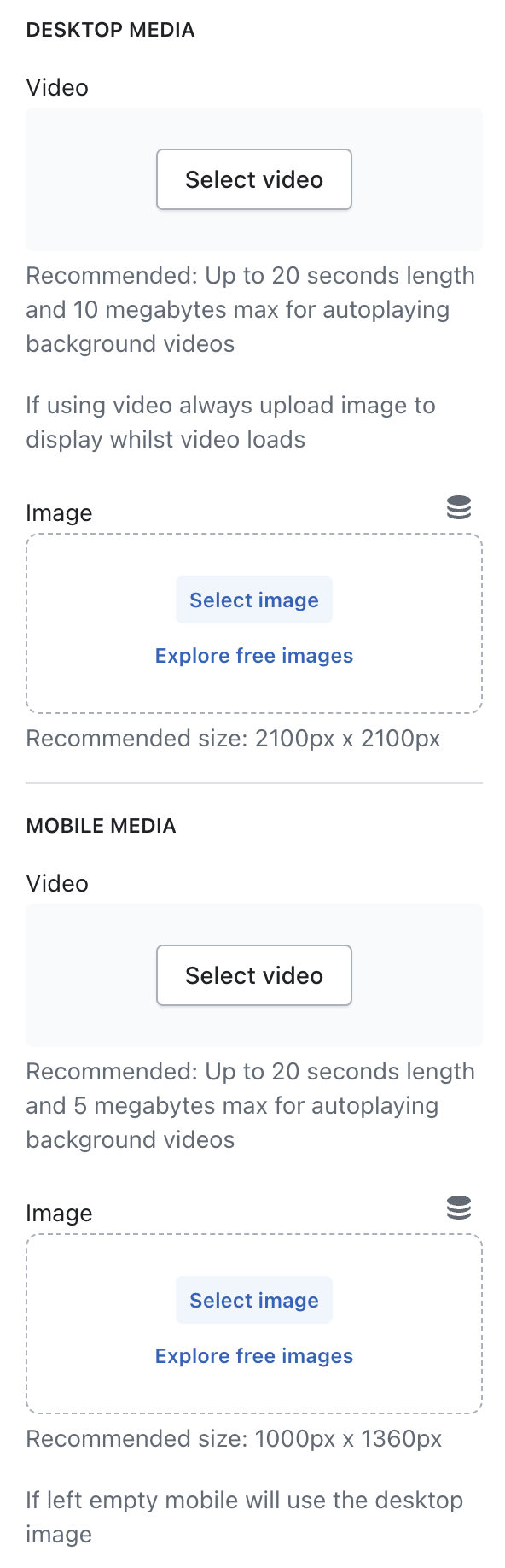
Video
The majority of our sections nowadays will allow for both videos and images. We suggest using Shopify for storage so that they can be used in html5 videos and without any adverts etc.
Image
Should always have the recommended size supplied, which should always be 2x the size output at for retina displays.
{
  "type": "header",
  "content": "Desktop media"
},
{
  "type": "video",
  "id": "desktop_video",
  "label": "Video",
  "info": "Recommended: Up to 20 seconds length and 10 megabytes max for autoplaying background videos"
},
{
  "type": "paragraph",
  "content": "If using video always upload image to display whilst video loads"
},
{
  "type": "image_picker",
  "id": "desktop_image",
  "label": "Image",
  "info": "Recommended size: [width]px x [height]px"
},
{
  "type": "header",
  "content": "Mobile media"
},
{
  "type": "video",
  "id": "mobile_video",
  "label": "Video",
  "info": "Recommended: Up to 20 seconds length and 5 megabytes max for autoplaying background videos"
},
{
  "type": "image_picker",
  "id": "mobile_image",
  "label": "Image",
  "info": "Recommended size: [width]px x [height]px"
},
{
  "type": "paragraph",
  "content": "If left empty mobile will use the desktop image"
}
If you don't require separate media for mobile/desktop then just use the first set and remove the desktop and desktop_ references. The labels don't need Desktop/Mobile next to them as they are in their respective headers.
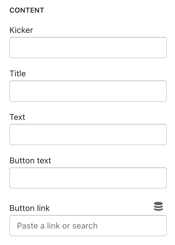
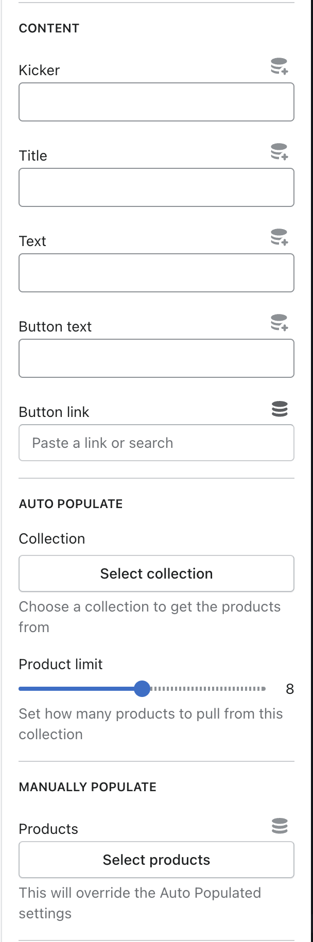
This is used for the general text/content of a section/block, the naming conventions we use are in reference to general newspaper terminology so please don't change Title to Header or Heading etc.
{
  "type": "header",
  "content": "Content"
},
{
  "type": "text",
  "id": "kicker",
  "label": "Kicker"
},
{
  "type": "text",
  "id": "title",
  "label": "Title"
},
{
  "type": "text",
  "id": "text",
  "label": "Text"
},
{
  "type": "text",
  "id": "button_text",
  "label": "Button text"
},
{
  "type": "url",
  "id": "button_link",
  "label": "Button link"
}
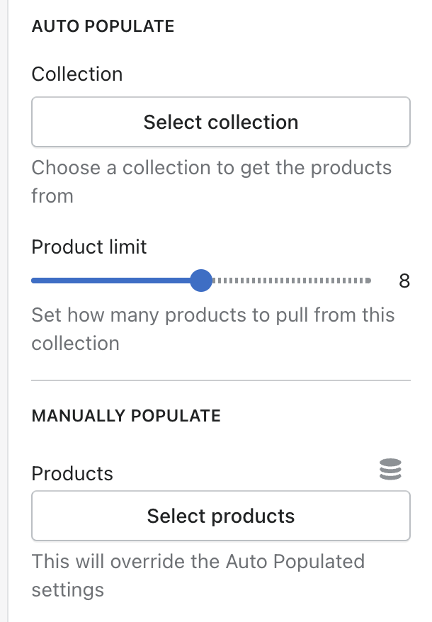
Auto populate
This allows a client to choose a collection to grab the products from and then set a limit for the amount to show
Manually populate
This is used along side the Auto Populate setting, allowing a client to pick individual products and override the collection choice.
{
  "type": "header",
  "content": "Auto populate"
},
{
  "type": "collection",
  "id": "collection",
  "label": "Collection",
  "info": "Choose a collection to get the products from"
},
{
  "type": "range",
  "id": "product_limit",
  "min": 4,
  "max": 12,
  "step": 1,
  "label": "Product limit",
  "default": 8,
  "info": "Set how many products to pull from this collection"
},
{
  "type": "header",
  "content": "Manually populate"
},
{
  "type": "product_list",
  "id": "products",
  "label": "Products",
  "info": "This will override the Auto Populated settings",
  "limit": 12
}
This can then be used like below for outputting the products
{%- liquid
  assign product_items = section.settings.collection.products
  assign product_limit = section.settings.product_limit

  if section.settings.products.count > 0
    assign product_items = section.settings.products
    assign product_limit = product_items.count
  endif
-%}

{%- for product_item in product_items limit: product_limit -%}
  {%- if product_item != blank -%}

  {%- endif -%}
{%- endfor -%}
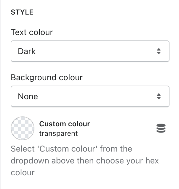
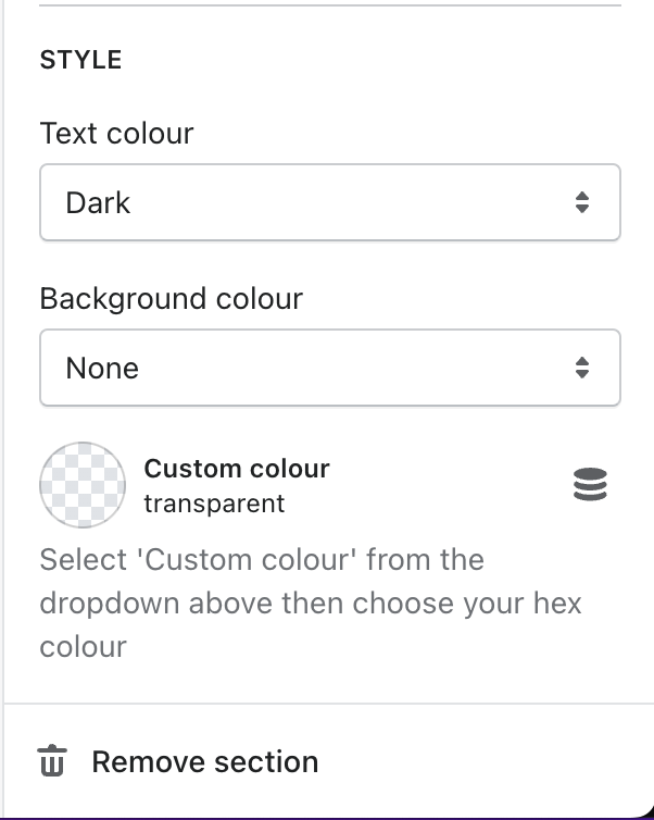
Text colour
{
  "type": "header",
  "content": "Style"
},
{
  "type": "select",
  "id": "text_colour",
  "label": "Text colour",
  "options": [
    {
      "value": "dark",
      "label": "Dark"
    },
    {
      "value": "light",
      "label": "Light"
    }
  ]
}
Background colour
If a section requires the ability to choose colours then we try to offer a dropdown of their common brand colours for ease of use, and then a backup hex field for if they want a completely custom field.
{
  "type": "header",
  "content": "Style"
},
{
  "type": "select",
  "id": "background_colour",
  "label": "Background colour",
  "options": [
    {
      "value": "transparent",
      "label": "None"
    },
    {
      "value": "custom",
      "label": "Custom colour"
    },
    {
      "value": "var(--Color_Blue)",
      "label": "Blue",
      "group": "Brand colours"
    },
    {
      "value": "var(--Color_Green)",
      "label": "Green",
      "group": "Brand colours"
    }
  ],
  "default": "transparent"
},
{
  "type": "color",
  "id": "custom_colour",
  "label": "Custom colour",
  "info": "Select 'Custom colour' from the dropdown above then choose your hex colour"
}
The reason for making the values as the css variables is so that it makes the code for using on the site much simpler, as you get css colour values directly from the dropdown or the custom hex field.
{%- liquid
  if section.settings.background_colour == 'custom'
    assign colour_to_use = section.settings.custom_colour
  else
    assign colour_to_use = section.settings.background_colour
  endif
-%}

<section style="--Background_Color: {{ colour_to_use }};">