Metafields
There are two types of metafield we commonly use on our stores. Both have slightly different limitations and layouts. Examples of both can be found below.
- Shopify Metafields
- Accentuate Metafields
Usage
Since the introduction of Shopify 2.0's Metafields and MetaObJects we now try to use these wherever possible, and only fallback to ACF where required. MetaObjects can be used to replace global ACF metafields, allowing the client to create reusable content for the site.
Naming conventions
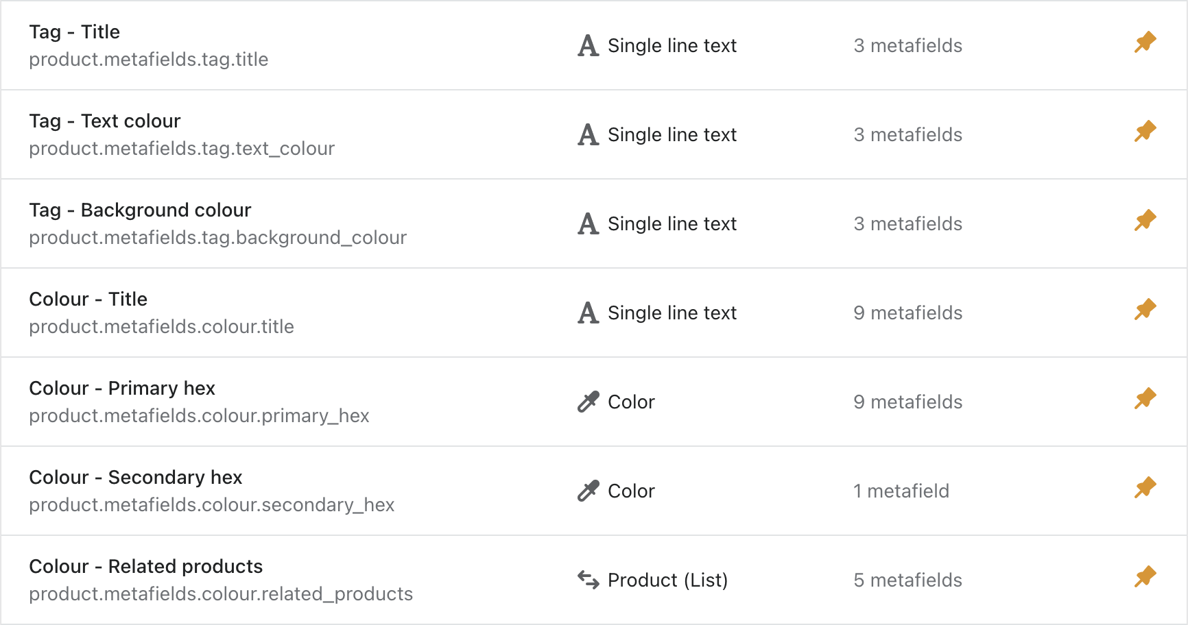
Because of the limitations with ordering and grouping, it is even more important that they are named in a way which makes it clear when fields are related to each other by using a prefix. The prefix should directly correlate to the namespace, with the key following it.
These would again be in sentence case to match the Customiser settings.
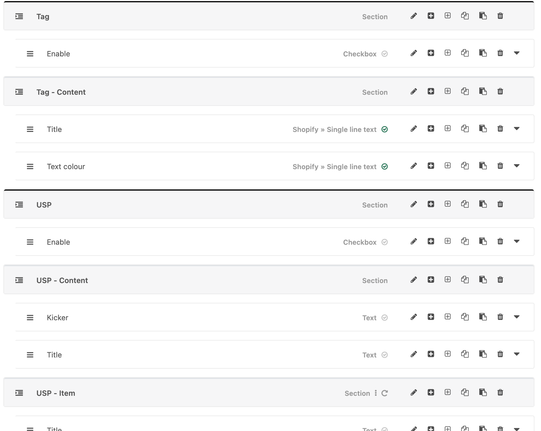
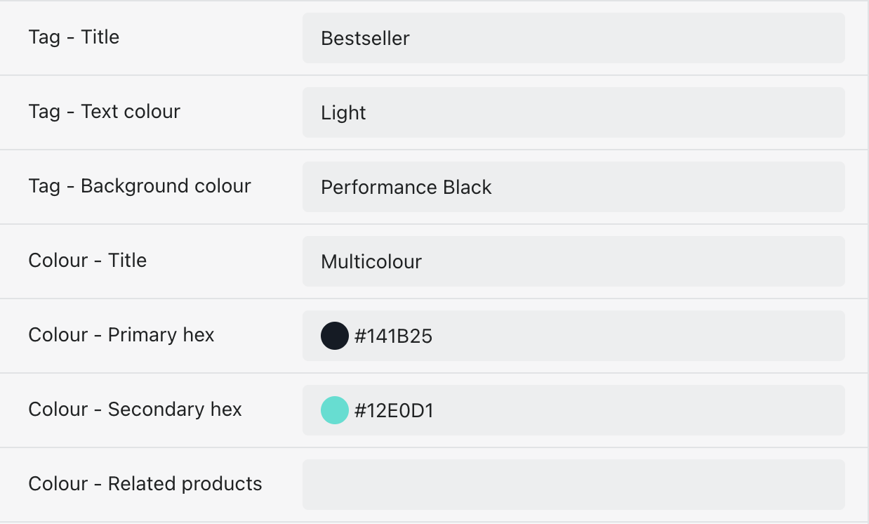
For example; if you were setting up a tag for a product card you may have the following metafields:
{
  Name: 'Tag - Title',
  Key: 'tag.title'
},
{
  Name: 'Tag - Text colour',
  Key: 'tag.text_colour'
},
{
  Name: 'Tag - Background colour',
  Key: 'tag.background_colour'
}
Usage
We have a lot more control over the style and functionality of ACF metafields. This gives us a lot more power, but also due to how ACF looks by default, it is easy for these to not be user friendly and just become a big list of nothing.
Sections
All metafields should be grouped into sections to keep the layout clean. We have two different types of sections
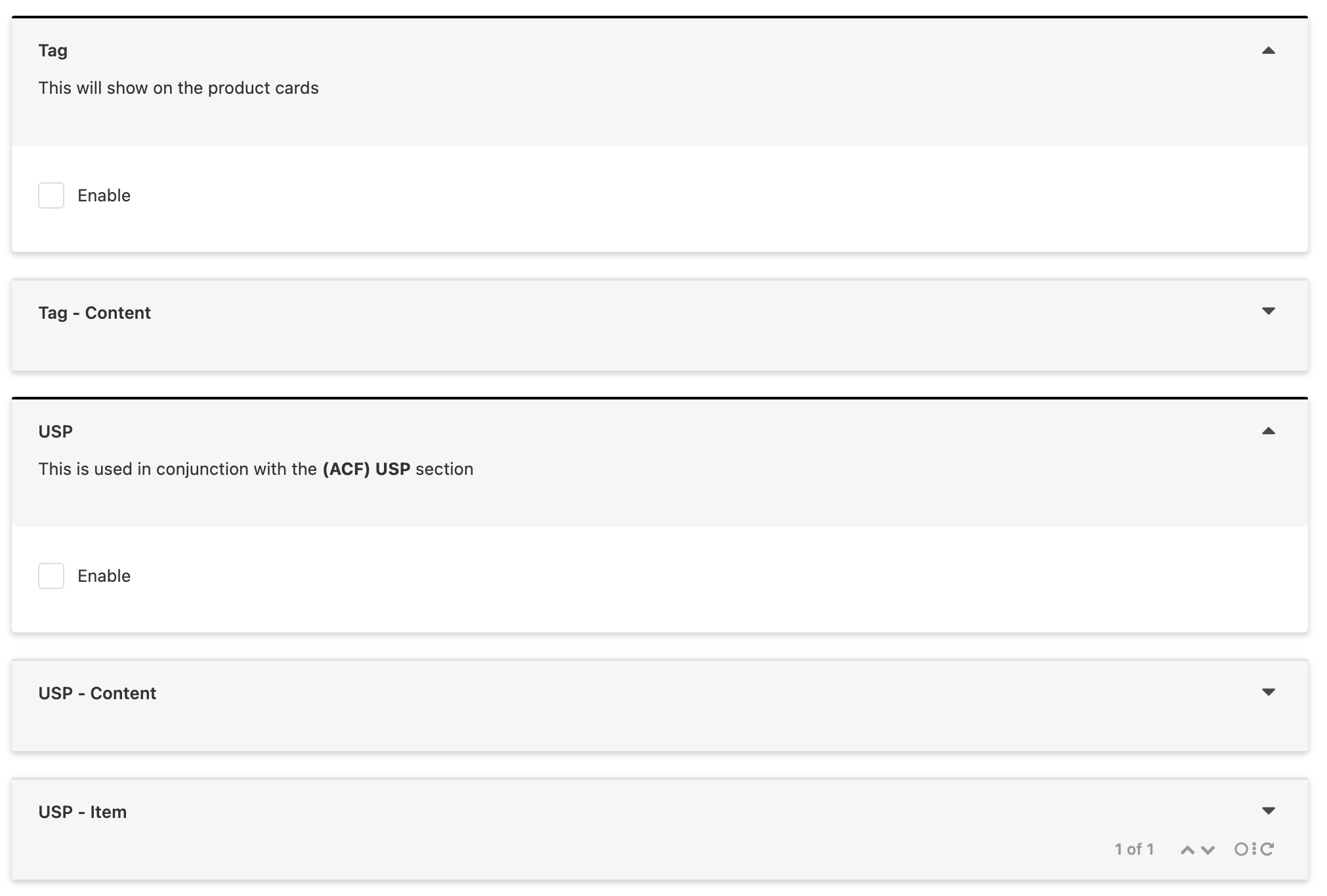
Header section
This should be used when the content following it is not related to the content before it.
Settings
- Solid black border #000000
- Always open by default
- Show section even if empty
- Should always have a description explaining what these metafields are for and where they are used
- If the content in these metafields directly relates to a Customiser section it should include that in the description “Relates to ACF Related Products section” (The description uses Markdown text so the ** makes the section name bold)
- If there is a user guide relating to this (product colours as an example) then that should also be included in the description using the markdown links
[User guide](www.image.com)
- Should only ever include an Enable checkbox if necessary, all other options should be under a Sub section for consistency and cleanliness
Sub section
These will contain the majority of the metafield fields and are used when they relate to the section above.
Settings
- Default grey border
- Show as collapsed when editing
- Include value of first field (optional)
- No description
Naming conventions
As with the Shopify metafields we stick with the Namespace - Key logic following through into ACF for consistency and to make naming easier. The Header Section title is used in the Sub section titles with a suffix added to define what sort of Sub section it is. These titles are then transferred into the namespace for the metafields inside the section.
[Header title] - Content
Used to store all of the metafields related to the main section The namespace for metafields within this section will be [header_title].[key] Note: We don’t make the namespace include _content here as we’ve hit namespace length limits. It also helps to keep them the same namespace level as Enable
[Header title] - Item
When the section is repeatable The namespace for metafields within this section will be [header_title_item].[key]
Again we can use the Tag example to show how that would translate into ACF
{
  Name: 'Enable',
  Key: 'tag.enable'
}
{
  Name: 'Title',
  Key: 'tag.title'
},
{
  Name: 'Text colour',
  Key: 'tag.text_colour'
}
Or an example for USPs
{
  Name: 'Enable',
  Key: 'usp.enable'
}
{
  Name: 'Kicker',
  Key: 'usp.kicker'
}
{
  Name: 'Title',
  Key: 'usp.title'
}
{
  Name: 'Title',
  Key: 'usp_item.title'
}
{
  Name: 'Text',
  Key: 'usp_item.text'
}